|
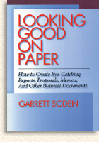
An excerpt from
 |
|
INTRODUCTION
The Hidden Power of Document Design
Not long ago, people in business didn't have to worry much about designing their documents because they didn't have that option. You simply rolled a sheet of paper into your typewriter (or asked your secretary to) and typed up your memo, report, or resume. Very few documents called for the time and expense of design, typesetting, and printing. The playing field was level. No one worried about a document's looks because they all looked pretty much the same.
Computers have changed all that, of course. Now anyone with a decent word processor and printer has a new set of powerful communication tools: thousands of fonts to choose from, unlimited font sizes, the ability to put type in columns, boxes, or tables, and much more.
Notice that I call these communication tools, not artistic tools or decorative tools. You can use these tools to simply decorate your document, but that's like using spreadsheet software to organize a laundry list. If you know how, you can instead use these tools to boost your communication to a far higher level of effectiveness. The tools are there - probably on your desk right now - whether you choose to use their power or not. This book is about choosing to use that power.
When used well, good document design will reveal your thinking. If your thinking is clear, that will be shown; if it's muddled, that will be shown too. There is no font that will put a good face on a bad idea.
Assuming your thinking is sound, the great advantage visual tools give you is the ability to put your ideas into the mind of your reader faster and more completely than your competitors. That makes it more likely that your ideas will be shared and talked about. Other things being equal, if your good idea is understood first, it will be put into action first. Let's take a closer look at this process.
Designed to Persuade
In their book Age of Propaganda, (W. H. Freeman & Company), psychologists Anthony Pratkanis and Elliot Aronson summarize the persuasion model based on the classic work of researcher Carl Hovland and his colleagues*:
1. The message must attract the recipient's attention.
2. The arguments in the message must be understood and comprehended.
3. The recipient must learn the arguments contained in the message and come to accept them as true.
4. We act on this learned knowledge and beliefs when there is an incentive to do so.
Each of these stages can be enhanced by good document design. In fact, good design can mean the difference between a document that successfully persuades and one that doesn't. Let's look at the critical role design plays at each step of the process:
1. The message must attract the recipient's attention. Most people realize that a well-designed document will attract more attention than a poorly designed one. But look closely at the statement. It says the message must attract attention - not the document. People often add wild fonts, big headlines, or irrelevant graphics to their work to try to "make it stand out from the crowd." It well may, but not for the right reasons. If your design does not attract attention to your message, then it is worse than useless because your reader will first be attracted to the document and then frustrated that the message can't be found, or will find a message that is at odds with the design. Either way, your reader will be confused and will move to the next step in the persuasion process reluctantly, if at all.
To attract a reader's attention visually to your message, you must know what you want to say, anticipate how your audience might react, and choose the form that will communicate best. The rules presented in Plan Your Design will help make sure you have done this before you start your actual design.
2. The arguments in the message must be understood and comprehended. Any argument is easier to understand if you can break it down into its components. You probably learned how to apply this method to your writing, beginning with a premise, followed by examples and a conclusion. Good writing uses verbal tools to signal the reader that certain information is a particular step in an argument. Good design uses visual tools to do the same thing. However, visual signals are not "read" or even absorbed consciously; no one ever says, "Ah! A subhead in 14-point Helvetica bold! This must be another point of the conclusion!" Nonetheless, by putting that subhead in 14-point Helvetica bold you make your reader understand that this point is part of the conclusion. Several sections of this book will show you how to use visual signals to divide your message into steps and then lead your reader through each one.
3. The recipient must learn the arguments contained in the message and come to accept them as true. Using visual tools to divide your argument, especially a complex argument, into sections makes it easier to learn. You might divide a report into four chapters; each chapter might be further divided into six sections; and each section divided into several parts. Although you can also do this in a typewritten document, the technique is much less effective. Page after page of a typewritten document, no matter how it is divided, will not be as memorable as pages divided with headlines and subheads that we can recall by "seeing" them with our mind's eye. And typewriting can't provide the variety of visual clues that good fonts and design can. Subtle spacing, bold, italics, large heads, and subheads can all make meaning clearer and learning easier.
Visual design can even help an argument seem "truer." Because visual signals are absorbed subconsciously, they are very persuasive. A weak point in your conclusion that appears in 14-point Helvetica bold along with all your other points will tend to seem just as strong as the others because it is just as big and bold as they are.
Just the fact that a document is set in type rather than typewritten gives us a visual clue that it is somehow more accurate because we have been conditioned by years of reading books, magazines, and newspapers. Subconsciously we accept that the printed word is more authoritative. By learning how to choose the appropriate fonts and layout for your work, you will learn how to create a visual tone that reinforces your credibility.
4. We act on this learned knowledge and beliefs when there is an incentive to do so. Visual design cannot, of course, create an incentive that will motivate your reader. But incentives to action are often more emotional than strictly rational, and visual effects are more evocative than words alone. Although photographs can be strong emotional motivators - by showing the image of an attractive person the reader may identify with, for example - there are many other ways to achieve emotional effects. A particular typeface or arrangement on the page can remind the reader of other publications and trigger a similar emotional response. Advertisers trying to sell products to Apple Macintosh users often mimic Apple's own publication style for just this reason. By understanding how these effects work, you will be able to subtly influence the emotional reaction of your readers.
How to Use This Book
Although each rule can be read independently, you'll get the most from this book if you read it straight through first. You don't need to study each example diligently - just become acquainted with the general ideas.
Then, the next time you create a document, write it using just the principles you can remember. That way you'll get your ideas down without the distraction of trying to write and design at the same time (although after you become more proficient, that is exactly what you will be able to do). When you are finished with the first draft, use the list of rules in the table of contents as a checklist. Ask yourself whether your document adheres to or violates each rule. If you don't understand the rule, look it up and reread its description.
Whether you're designing a memo, a report, or a newsletter, you'll find that the design principles are the same; however, you'll use (or skip) specific rules depending on the particulars of your document.
By the time you've created a few documents using the ideas in this book, I hope you'll see document design in a new light: not as a mysterious, arty endeavor, but as the very fundamental process of ordering information visually for maximum communication.
* Hovland, C. I., Lumsdaine, A. A., & Sheffield, F. D. (1949). Experiments on mass communication. Princeton, NJ: Princeton University Press; Hovland, C. I., Janis, I. L., & Kelley, H. H. (1953). Communication and persuasion. New Haven, CN: Yale University Press; Hovland, C. I. (1957). The order of presentation in persuasion. New Haven, CN: Yale University Press; Hovland, C. I., & Janis, I. L. (1959). Personality and persuasibility. New Haven, CN: Yale University Press; Hovland, C. I., & Rosenberg, M. J. (1960). Attitude organization and change. New Haven, CN: Yale University Press; Sherif, M., & Hovland, C. I. (1961). Social judgment. New Haven, CN: Yale University Press.
Return to list of Books
|
|
